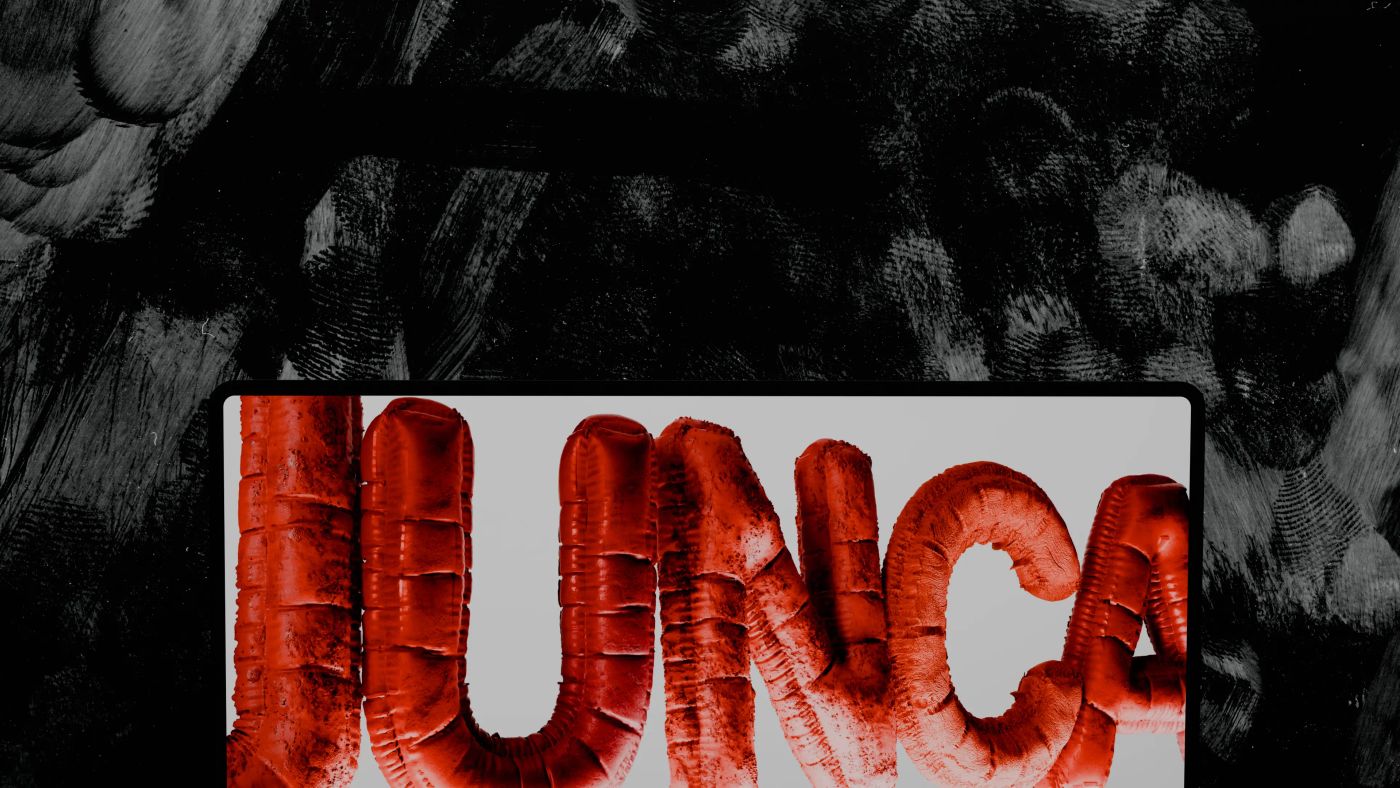
The Fusion Industry Association's 2026 survey counted 56 private fusion companies, which raised $4.48 billion in the twelve months to July 2026. Fifty-six teams working on fusion, pitching overlapping investors and hiring from the same small pool of plasma physicists. At that density, the science alone no longer makes you memorable.
That is the real problem deeptech branding has to solve: not looking advanced, but being recognizable among companies that are all advanced. We designed the identity and website of BotBlox and built the sites of Hylight, Kestrix and Skipper NDT, four companies whose value sits in things a camera can't capture: data, heat, magnetic fields, a mission in the air. Here is the method we use to build a brand from the technology itself, applied sector by sector, with the BotBlox identity as a worked example.
Key takeaways
- Deeptech brands look alike because they borrow the codes of their category, such as gradients, glowing networks and globes, instead of the facts of their own technology.
- The most distinctive visual material a deeptech company owns is its mechanism: what the technology senses, moves, is made of and outputs.
- Every identity decision should trace back to something true about the company. BotBlox's wordmark became BotBlox Systems to state its move from components to embedded systems.
- In long B2B cycles, being remembered beats looking polished: only about 5% of business buyers are in the market for a given service in any quarter.
- Design the identity and the website as one system, and take the big step before a fundraise rather than after it.
Why do most deeptech brands look the same?
Most deeptech brands look alike because they borrow the codes of their category instead of the facts of their technology. Founders are engineers who rightly distrust marketing, the first identity is often made in a week before a pre-seed round, and the safe choice is to look like the companies investors already funded.
The result is a shared vocabulary that now says "tech company" and nothing more. Each cliché tries to say something true, and each has a more precise alternative:
| Cliché | What it tries to say | What to show instead |
|---|---|---|
| A glowing network of dots | We connect things, we use AI | The real data flow: what moves, from where to where |
| A blue-to-purple gradient | We are the future | A palette drawn from your materials or operating environment |
| A spinning globe | We operate worldwide | The specific places your product works, shown precisely |
| A stock laboratory | We do real science | Your own lab, team and prototypes, even imperfect |
| Hexagons and molecules | We work on chemistry or materials | Your actual structure, at the scale that matters |
| A glowing brain | We do AI | What the model takes in and what it returns |
A motif is not a cliché in itself. It becomes one when it decorates instead of describing. The BotBlox site shows circuit paths and a globe, two of the most common motifs in the category, and both are literal: BotBlox hardware moves data through circuit boards, on platforms that operate in space, underwater and in the air.
How do you build a brand for technology you can't see?
You build it from the mechanism: what the technology senses, what it moves, what it is made of and what its output looks like. Competitors can copy a gradient. They can't copy your physics.
Before any moodboard, we ask five questions:
- What does it sense or measure? Heat, magnetic fields, vibration, light.
- What does it move or transform? Data, energy, matter, a vehicle.
- What is it made of? Metals, membranes, silicon, composites.
- Where does it operate? Orbit, the seabed, a substation, a building facade.
- What does its output look like? A heat map, a point cloud, a spectrum, a dashboard.
The answers become the visual raw material. Kestrix maps heat loss across buildings with drones and thermal analysis, so its output is the heat itself: the scroll-driven 3D header follows thermal data from capture to analysis to insight. Skipper NDT inspects buried pipelines, so its visuals show the inspection process and the field kit, with drone, rugged case, sensor cart and software presented as one system.
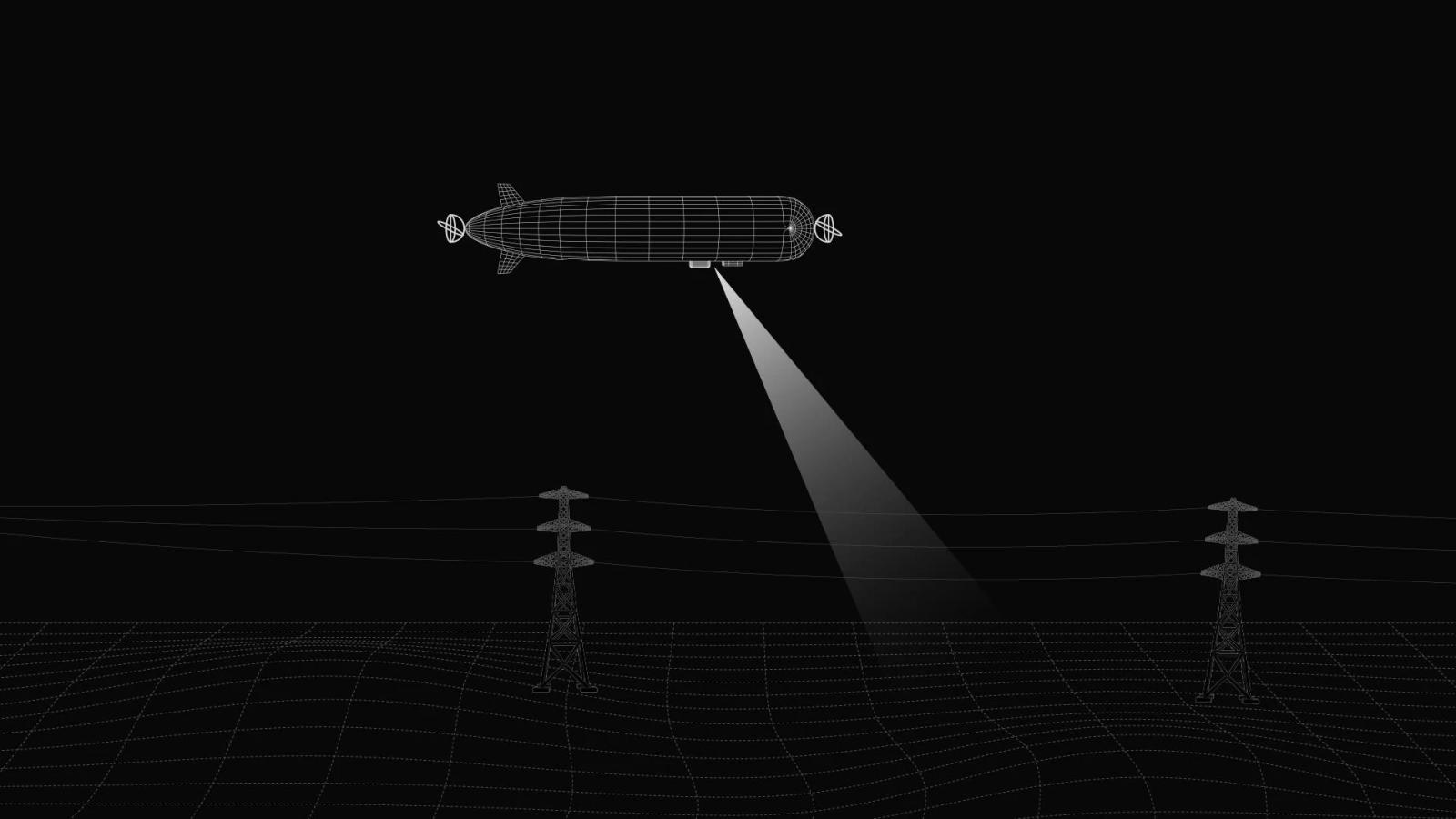
Hylight inspects power lines, pipelines and railways with hydrogen airships. The visual language came from the mission: a wireframe airship sweeping a beam across a wireframe landscape. The line drawing reads as engineering, and the beam is the inspection.
Deeptech branding, sector by sector
The method stays the same in every sector, but the raw material changes with the technology. Here is where we would look first in five sectors, and the cliché each one falls into most often.
Branding for a semiconductor startup
Start from the scale nobody can see: the geometry of a die, the layers of a process, the timing of a signal. Precise line work and measured typography carry that better than a glowing circuit board, which every chip company already uses.
Branding for a robotics company
Start from motion: the paths a robot follows, the environments it works in, the tasks it repeats. Real footage of the machine at work, even unpolished, beats a humanoid silhouette lit in blue.
Branding for a climate tech company
Start from the measured effect: the heat, carbon or energy your technology tracks or saves, shown as data. Leaves and the Earth seen from orbit say "climate" without saying what you do, while a heat map like Kestrix's says both.
Branding for a fusion or energy company
Start from the machine and its confinement geometry, the part of the technology that differs from one company to the next. A glowing sun is the one image all 56 fusion companies could share.
Branding for a medtech or surgical robotics company
Start from the clinical gesture and the materials a surgeon trusts: precision, sterile surfaces, controlled motion. Restraint is part of the identity, because every claim has to stay within what regulators have cleared.
| Sector | Mechanism to draw from | Cliché to avoid |
|---|---|---|
| Semiconductors | Die geometry, process layers, signal timing | The glowing circuit board |
| Robotics | Motion paths, operating environments, repeated tasks | The blue-lit humanoid silhouette |
| Climate tech | Measured heat, carbon or energy flows | Leaves and the Earth from orbit |
| Fusion and energy | The machine and its confinement geometry | The glowing sun |
| Medtech | The clinical gesture, sterile materials | The heartbeat line |
From mechanism to identity: the BotBlox example
An identity is a short list of decisions, and in deeptech each one should trace back to something true about the company. BotBlox designs tiny, rugged networking, edge compute and sensing hardware for autonomous systems, from drones and satellites to subsea robots. The company had outgrown its image: the engineering was there, the frame around it was not.
The rule we set at the start of the brand direction was one sentence: the goal is not to make BotBlox look more designed, it is to make BotBlox look more accurate. Here is how that rule became decisions:
| Decision | What we chose | What it traces back to |
|---|---|---|
| Name | The wordmark became BotBlox Systems | The move from components to embedded systems |
| Mark | The original running-man icon, in a tighter wordmark | Years of recognition among engineers |
| Headline typeface | Space Grotesk | The terminals and tools engineers work in |
| Text typeface | IBM Plex Sans | Spec tables that must stay readable |
| Color | Only colors that map to a product fact | Where it operates, what it carries, what it is made of |
| Imagery | Studio-lit products on dark, real operating environments | Hardware that must look engineered, not assembled |
| Data | Circuit paths, bandwidth visualizations, a particle logo | Data moving through the hardware |
Both typefaces were chosen for their origins. Space Grotesk is a proportional variant of the monospaced Space Mono family, with the feel of code without its stiffness, and IBM Plex Sans is the typeface IBM designed for itself and offers for free.
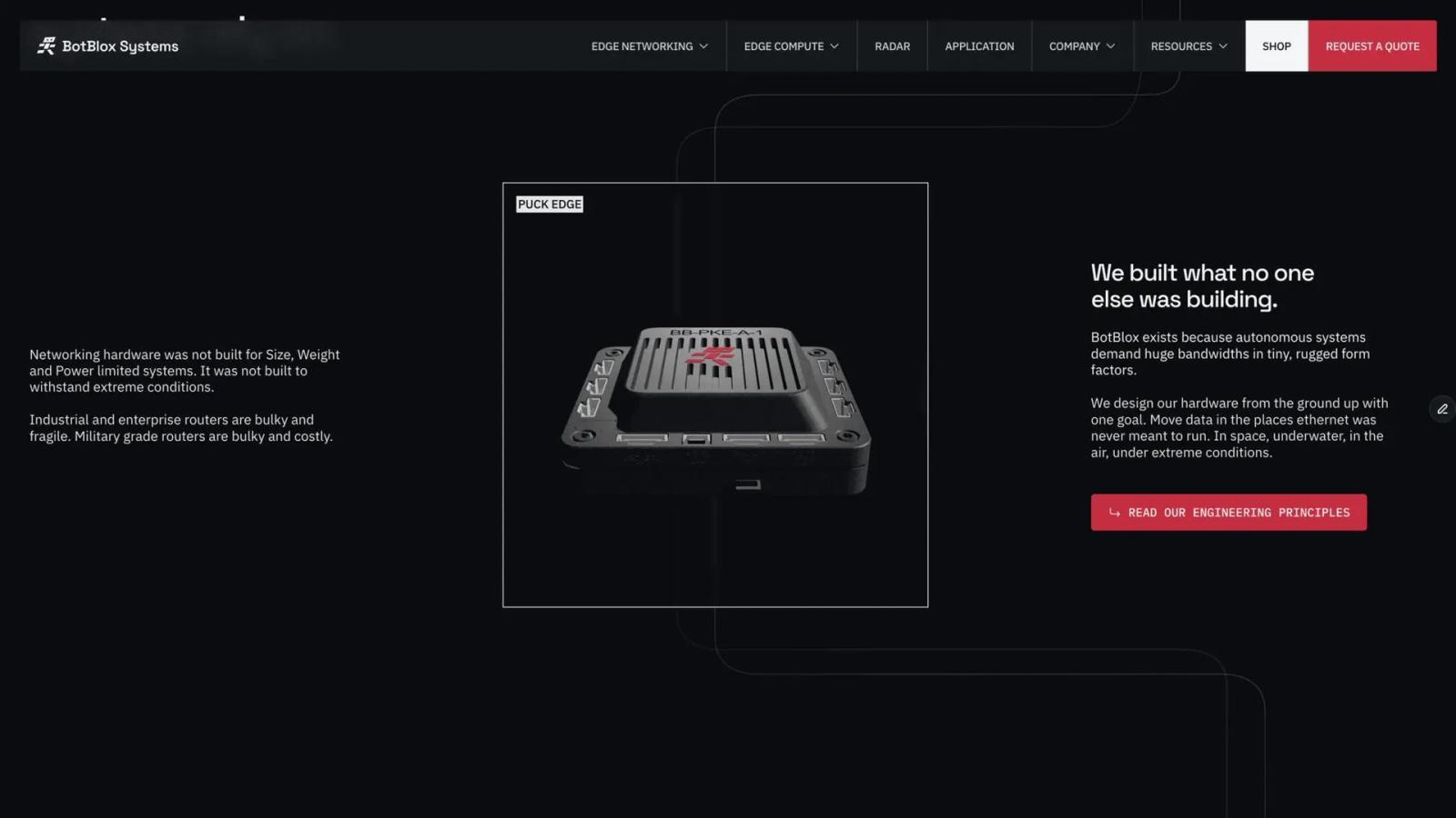
None of these choices is spectacular on its own. Together they make a company built around the smallest, most rugged components read as what it is: infrastructure for autonomous platforms.
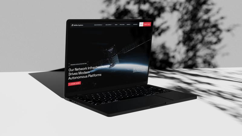 Case study · Robotics & HardwareBotBlox: Moving data where ethernet was never meant to runView the project
 Why does distinctiveness beat polish in B2B?
In deeptech, most of the people who will buy from you are not buying today, so the brand's real job is to be remembered on the day they are. Research from the Ehrenberg-Bass Institute estimates that only 20% of business buyers are in the market for a given service in a year, and 5% in a given quarter, because companies change providers of services such as software or telecoms around every five years.
In our clients' markets, with pilots, certifications and procurement committees, the wait is often longer. The LinkedIn B2B Institute draws the consequence plainly: "the brand that is most easily remembered is the brand that gets bought."
Memory runs on distinctiveness, not on polish. Jenni Romaniuk of the Ehrenberg-Bass Institute, whose foundational work on distinctive brand assets shaped the field, judges an asset on fame, whether buyers link it to you, and uniqueness, whether it points to you and no one else. She insists on contrast with the environment the asset appears in. In a category of blue gradients and glowing networks, contrast is the cheapest asset you can own.
One identity for investors, engineers and recruits
A deeptech brand has to convince three audiences who judge different things, so the identity stays constant and only the depth changes:
| Audience | What they check | What proves it |
|---|---|---|
| Investors | Is this company category-defining and mature enough for the next round? | A precise one-line statement, clarity, restraint |
| Engineers and technical buyers | Is the technology real? | Correct units, honest renders, specs one click away |
| Future hires | Would I bet the next five years here? | Real people, real labs, real work |
On the BotBlox site, the same system runs with different emphasis: application pages are more narrative, product pages more structured and spec-driven, company pages lighter to read. It is the brand version of the layered narrative we describe in how to explain complex technology on a website.
Should the identity and the website be designed together?
Yes: for a deeptech company, the website is where the identity is used most and tested hardest, so designing the two separately loses half the decisions in translation. A brand book can say "precise". Only a live page shows whether the type scale holds on a spec table, whether the accent color survives on a button, whether motion reads as engineering or as decoration.
That's why we decide those things once, for both. For BotBlox, motion rules were part of the identity: no bouncy or elastic easing, micro-interactions between 150 and 300 milliseconds, and 3D used to show how data moves and how modules connect, never for spectacle.
3D deserves a specific word. A product modeled in Blender becomes a brand asset that outlives the website: the same model feeds the homepage, the deck, the datasheet and the trade-show screen. We explain the process in how to show a hardware product on your website.
When should a deeptech startup invest in branding?
Invest in proportion to what the brand has to carry, and take the big step before a fundraise rather than after it.
| Stage | What you need | What can wait |
|---|---|---|
| Pre-seed | A name you can own, a clean wordmark, one typeface, two colors | A full brand system |
| Seed | The visual system: type, color, imagery and motion rules | A thick brand book nobody opens |
| Before a Series A | Identity and website together, ready before due diligence | A rebrand after the round closes |
| Repositioning | A name or wordmark that states the new scope | An identity that still describes the old company |
We cover the seed moment in what to change after a seed round and the scrutiny before a raise in the investor-ready website. For reference, our projects that combine branding, custom 3D and the website typically reach $20,000 and more, over 8 to 12 weeks, while a focused website starts around $6,000.
What to look for in a deeptech branding partner
The right partner understands your technology before drawing anything, so judge them on how they start, not only on their portfolio. Five signals separate a studio that can brand deeptech from one that will apply a style to it:
- They read before they draw: they ask for your white paper, deck or technical documentation before the first moodboard.
- They can explain your mechanism back to you: in plain words, without an error an engineer would spot.
- They make the hard visuals in-house: 3D, data visualization and motion, not only logos and palettes.
- They design the identity and the website as one system: nothing gets reinterpreted between the brand book and the live page.
- They tell you what not to show: a render of a function you don't have yet, a claim your data can't support.
Ask to see work for technical companies, and ask who on their side will read your documentation. These are the criteria we hold ourselves to on every branding project.
Checklist: is your deeptech brand distinctive?
- Hide the logo on your homepage: a visitor can still tell whose site it is.
- Every color, typeface and motif traces back to your mechanism, your materials or your market.
- No visual on your site could be used by a direct competitor without lying.
- Your invisible technology, whether data, heat, signal or field, has a designed visual form.
- Products appear lit and in context, never in stock photography.
- The same system runs across the site, the deck, the datasheets and the careers page.
- An engineer finds nothing inaccurate, and an investor finds nothing generic.
A deeptech brand is the technology made recognizable, and the method is the same whether the site is built in Framer or in custom code with Astro and Next.js. To see how it plays out across a full project, start with our web design for deeptech startups or our branding and identity services. And if your technology is a decade ahead while your identity still looks like a template, let's talk.