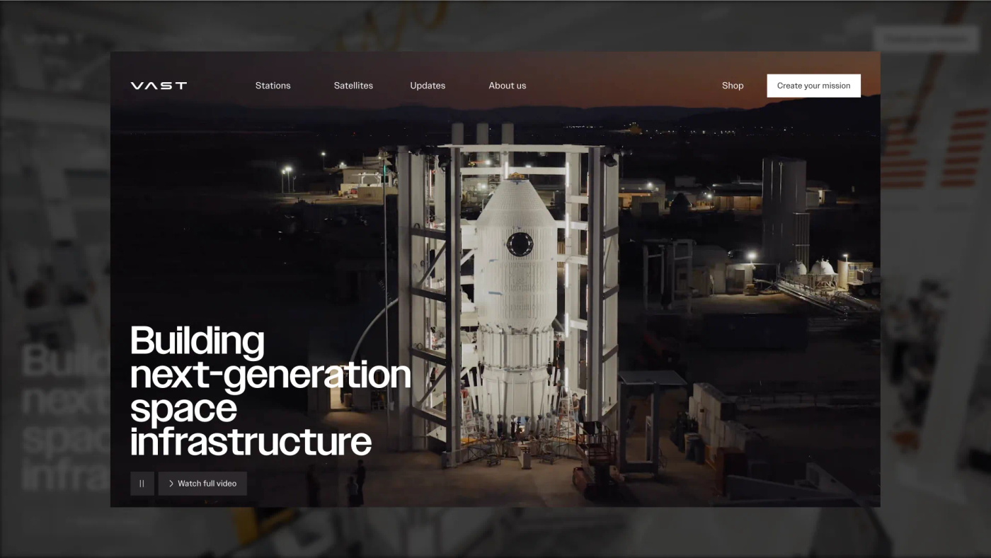
The paradox we see on every deeptech project: the more impressive the technology, the worse the website usually explains it. Teams that can build hydrogen airships or map heat loss from drones somehow produce homepages nobody outside the lab can parse.
This isn't a writing-talent problem. It's a method problem, and after building websites for Hylight, Kestrix, and BotBlox, we've turned the method into something repeatable. Here it is.
Why smart teams explain badly
Two forces work against you. The first is the curse of knowledge: once you understand magnetometry or thermal mapping deeply, you literally cannot remember what it was like not to. Your "simple" explanation still assumes three concepts your visitor doesn't have.
The second is that jargon doesn't just confuse, it repels. Research from Ohio State University found that specialized terms make readers feel the message isn't for them, reduce their interest in the topic, and increase resistance to persuasion, even when the jargon is defined in the text. Defining your acronyms is not a fix. Not needing them is.
Add the reading reality, Nielsen Norman Group's research shows visitors read roughly 20–28% of the words on a page, and the conclusion is clear: you don't get to explain everything. You get to explain the right things, in the right order.
The layered narrative: serve both audiences without losing either
Every complex-tech website has two visitors: the generalist (investor, procurement lead, journalist) who needs to get it fast, and the specialist (technical buyer, co-investor's expert, future hire) who needs to verify it's real. Most sites pick one and lose the other. The fix is layering:
- Layer 1 · The sentence: what you do, for whom, in plain words. No mechanism yet.
- Layer 2 · The mechanism: how it works, shown visually: a diagram, a 3D scene, an animated pipeline. Still no equations.
- Layer 3 · The depth: specs, white papers, documentation, publications. One click away, clearly labeled, never forced on anyone.
The generalist never hits layer 3. The specialist skips to it. Both leave convinced, and neither felt the site was written for someone else.
Write the one sentence first
Before any design work, we write the layer-1 sentence and test it with what we call the repeat test: after ten seconds on the page, can a visitor explain the company to a colleague? Not admire it, repeat it.
"Hydrogen airships for infrastructure inspection" passes. "Reinventing aerial intelligence for a sustainable future" does not: it's admirable and unrepeatable. Specificity is what makes a sentence portable, and portable sentences are how word-of-mouth (and AI search engines) describe you.
Show the mechanism, not the magic
Complex technology becomes believable the moment people can see how it works. On the Kestrix site, the scroll-driven 3D header walks the visitor through the actual product pipeline, capture, analysis, insight, so the narrative structure is the technology. Nobody reads a paragraph about "AI-powered thermal analytics"; they watch it happen.
Pick the medium by the nature of the mechanism:
- Physical product that moves → real footage, or 3D when filming is impractical (that's why we built Hylight's airship in 3D).
- Process or pipeline → scroll-driven step-by-step animation.
- Invisible technology (data, signal, algorithm) → design the data itself: visualizations that make the invisible legible.
- System architecture → one clean diagram beats four paragraphs. Always.
Give every number a handle
Specialists trust numbers; generalists trust comparisons. Serve both at once by anchoring every metric: not "0.5 nT sensitivity" but "0.5 nT sensitivity, precise enough to detect a buried pipeline's magnetic signature from the surface". The spec stays for the expert; the anchor carries everyone else. A number without context is decoration, and according to that same Ohio State research, decoration that alienates.
The jargon budget: practical rules we apply
- One new term per screen. If a section introduces two specialized concepts, split it or cut one.
- The buyer's words win. Mirror the vocabulary your customers use in sales calls, not the one your R&D team uses in papers.
- Acronyms earn their place. If it appears fewer than three times on the page, spell it out or delete it.
- Analogies anchor in the buyer's world, not in yours: "like an MRI for pipelines" works because the buyer knows MRIs, not because it's technically perfect.
- Read it to an outsider. Literally. Where their eyes glaze is where your funnel leaks.
Checklist: is your technology page doing its job?
- A visitor can repeat what you do after ten seconds.
- The mechanism is shown (video, 3D, diagram), not just described.
- Technical depth exists, one click away, clearly labeled.
- Every metric has a comparison or consequence attached.
- No acronym appears without earning its place.
- The page answers "why now" and "why you", not just "what".
- An expert would find nothing to object to; a generalist, nothing to skip.
This is the exact method behind our web design work for deeptech startups, and it's also what makes a site hold up under investor scrutiny, as we detailed in The investor-ready website. If your technology deserves better storytelling than it's getting, let's talk.