


Your buyers should understand the product in one scroll. Today they need a demo.
UX, structure and messaging for complex B2B products, before any visual design

What it is
Web design and UX for a tech company is the work that decides what a buyer understands, in what order, and how the site looks and behaves while they read: the message, the page structure, the wireframes, the copy, the interface and the design system.
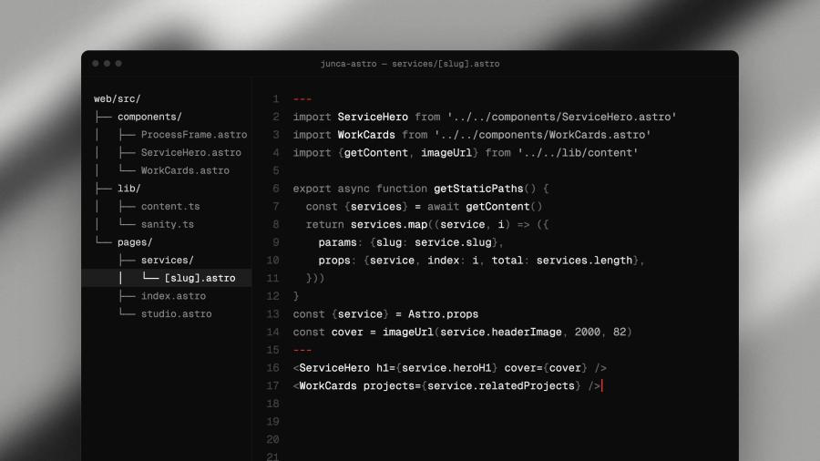
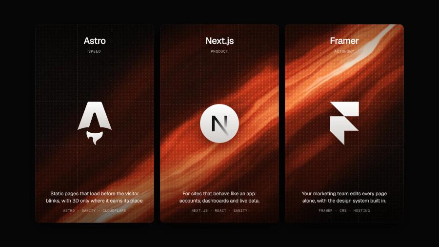
Junca designs it with the founders and writes the copy with them, then builds the site in Framer or in code, or hands it to your developers.
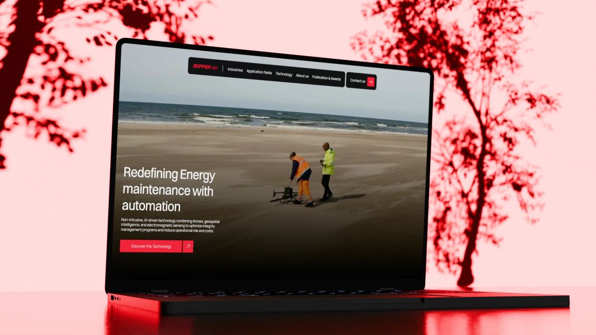
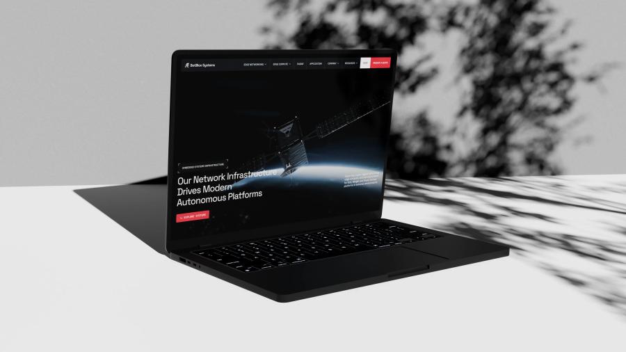
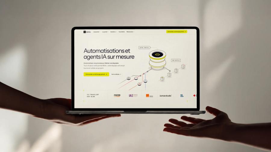
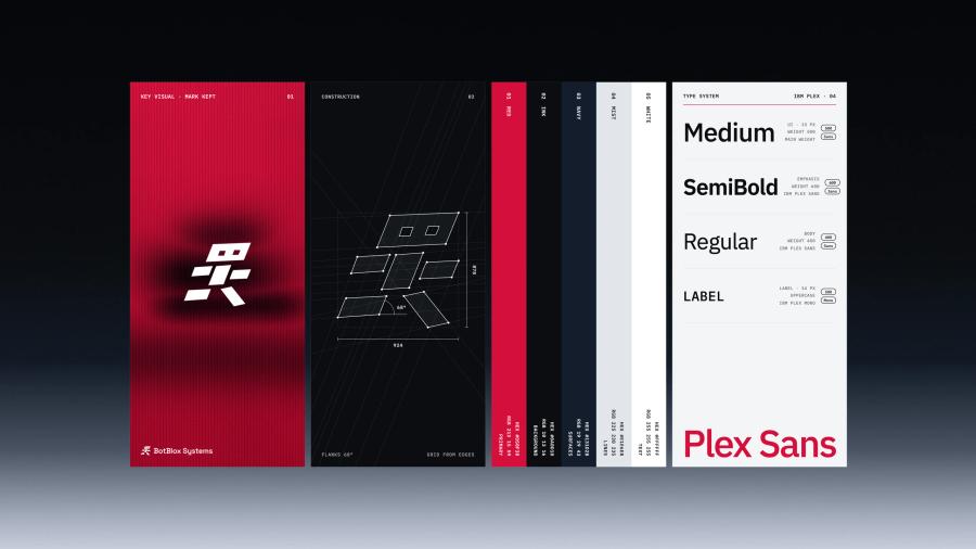
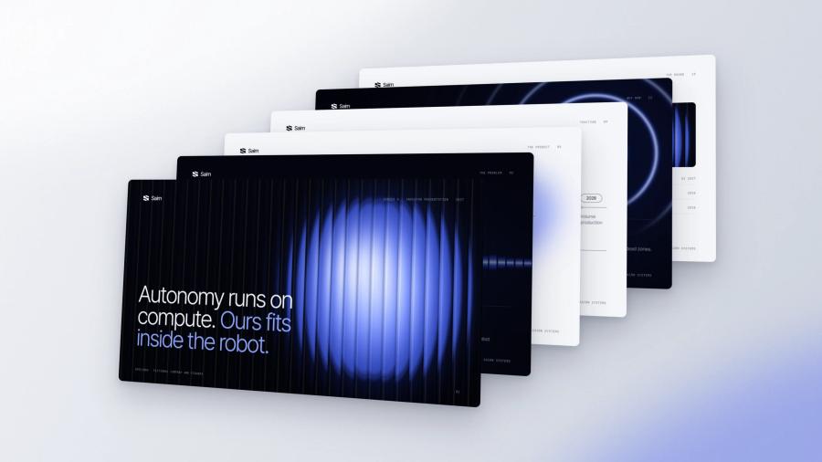
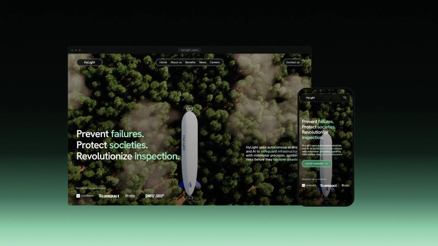
We do not deliver static pictures. The design is reviewed as live pages that look and behave like the finished site, with a documented design system, so whoever builds it builds exactly what was approved. BotBlox, Kestrix, Skipper NDT and Hylight were designed this way.
The problem
The product is clear to your engineers. The website is not clear to anyone else.
Why tech websites fail to explain the product
Most tech websites are designed from the inside: a look chosen before the message, features in the order they were built, one page for every audience, and mockups that only work on a large screen. Buyers leave before they reach the part that matters.
The traps
Trap 0101 / 05
Look before meaning
Designed before it was understood
The mockups start before anyone has written down what a buyer must understand. The site looks premium and says little. We fix the message and the structure first, then design around them.
Trap 0202 / 05

Built in the wrong order
Features in the order you built them
The homepage walks through the product the way the team developed it, and the answer a buyer came for sits at the bottom. We order every page around the questions buyers ask, in the words they use.
Trap 0303 / 05
One page for everyone
Investors, buyers and engineers on the same page
Each audience needs a different proof, and a single generic page serves none of them. We map who reads the site and give each one a path, without splitting the brand.
Trap 0404 / 05
Desktop only
Perfect on a large screen, broken on a phone
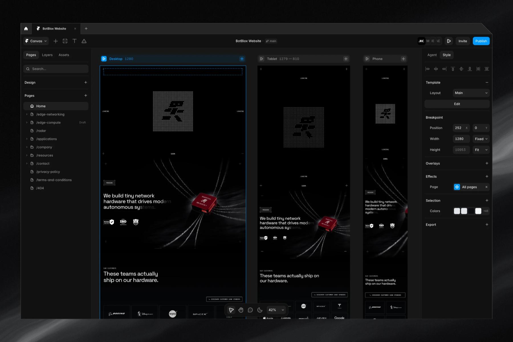
The design is approved at desktop width and improvised for everything else. We design every page at desktop, tablet and phone widths, and review them on real devices.
Trap 0505 / 05
Handed over flat
A picture of a website
Static mockups leave developers to guess hover states, animations, spacing and edge cases. We deliver live pages and a documented design system, so nothing is left to interpretation.
The process
How we design a website for a technical product
Message, structure, interface and design system are designed by a team that also builds sites, so every screen is buildable. You review everything in the Junca client portal: the copy section by section, and the designs as live pages.
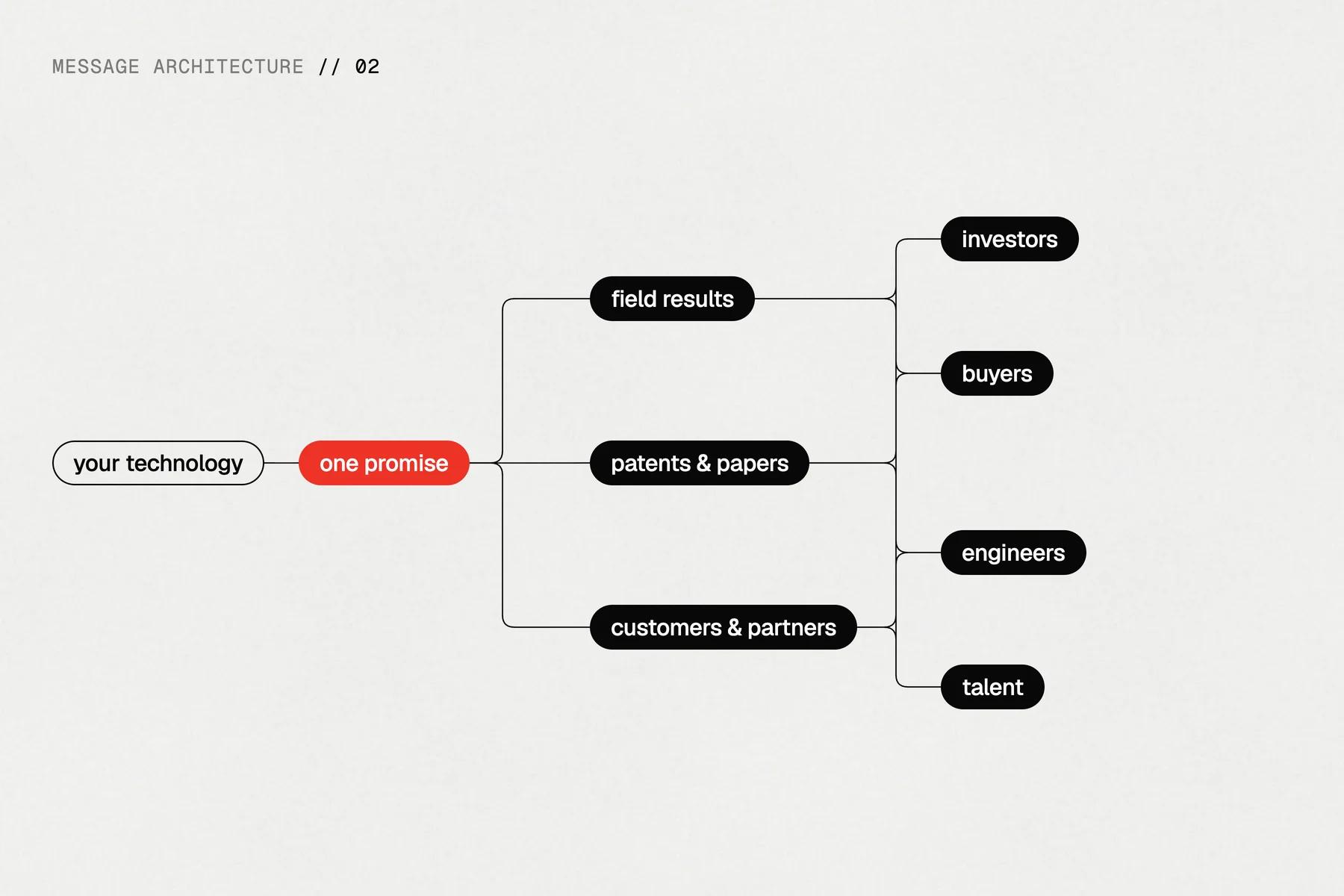
Step 01
Message
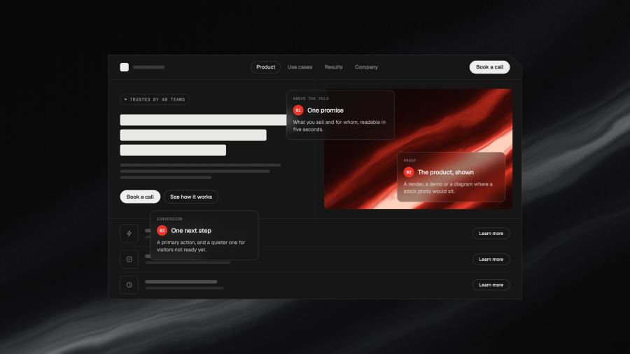
Interviews with the founders and the people who sell, then one promise, the proof behind it, and how it reads for each audience.
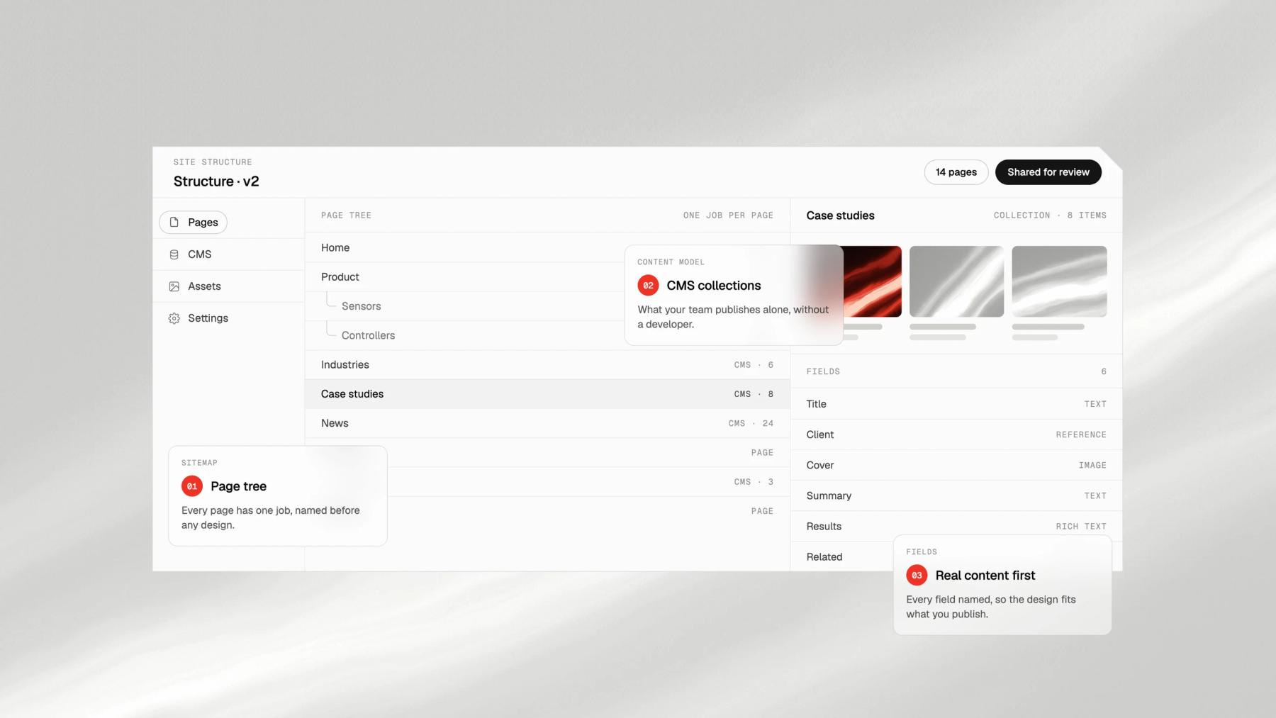
Step 02
Structure
The page tree, the content of each page and the CMS model, fixed before any visual work.
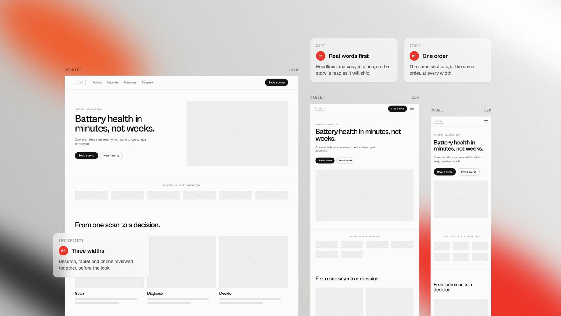
Step 03
Wireframes and copy
Low-fidelity pages with the real copy in place, so the order of the story is settled before the look.
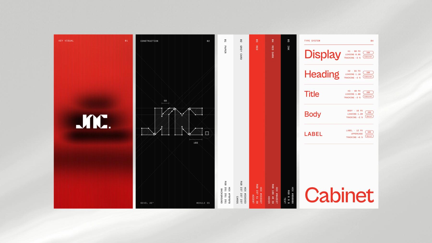
Step 04
Interface and design system
The art direction applied page by page at desktop, tablet and phone widths, with tokens and components documented.
Step 05
Live review and handoff
Designs reviewed as live pages, then built by us in Framer or in code, or handed to your developers with the design system and assets.
What you get
Everything the project needs, from one team.
Message architecture
One promise, the proof behind it, and how it reads for investors, buyers, engineers and future hires.
Sitemap and content model
The page tree, the content of each page and the CMS collections, before any visual work.
Wireframes and copy
Every page in low fidelity with its real copy, written with your team and reviewed section by section.
Interface design
Every page at desktop, tablet and phone widths, reviewed as live pages that behave like the final site.
Design system
Type, colour, grid, components and states, documented for whoever builds the site.
Assets
Icons, illustrations and image exports, ready for the build in Framer, in code or by your developers.
Selected work
Websites we designed for technical products
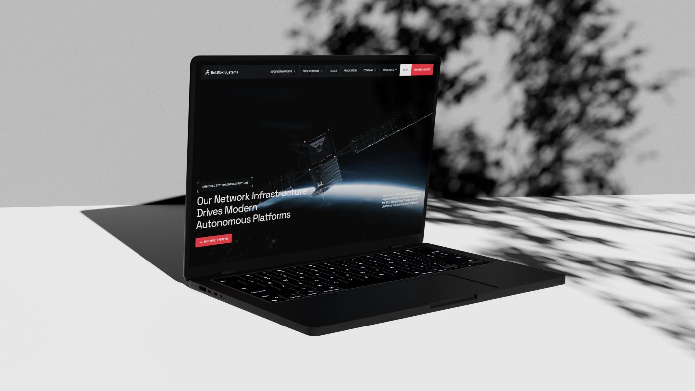 Corporate website
BotBlox: moving data where ethernet was never meant to run
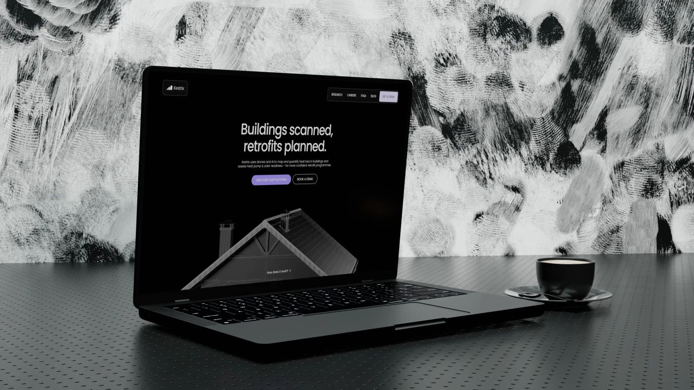 Showcase website
Kestrix: making thermal data readable to accelerate building retrofit
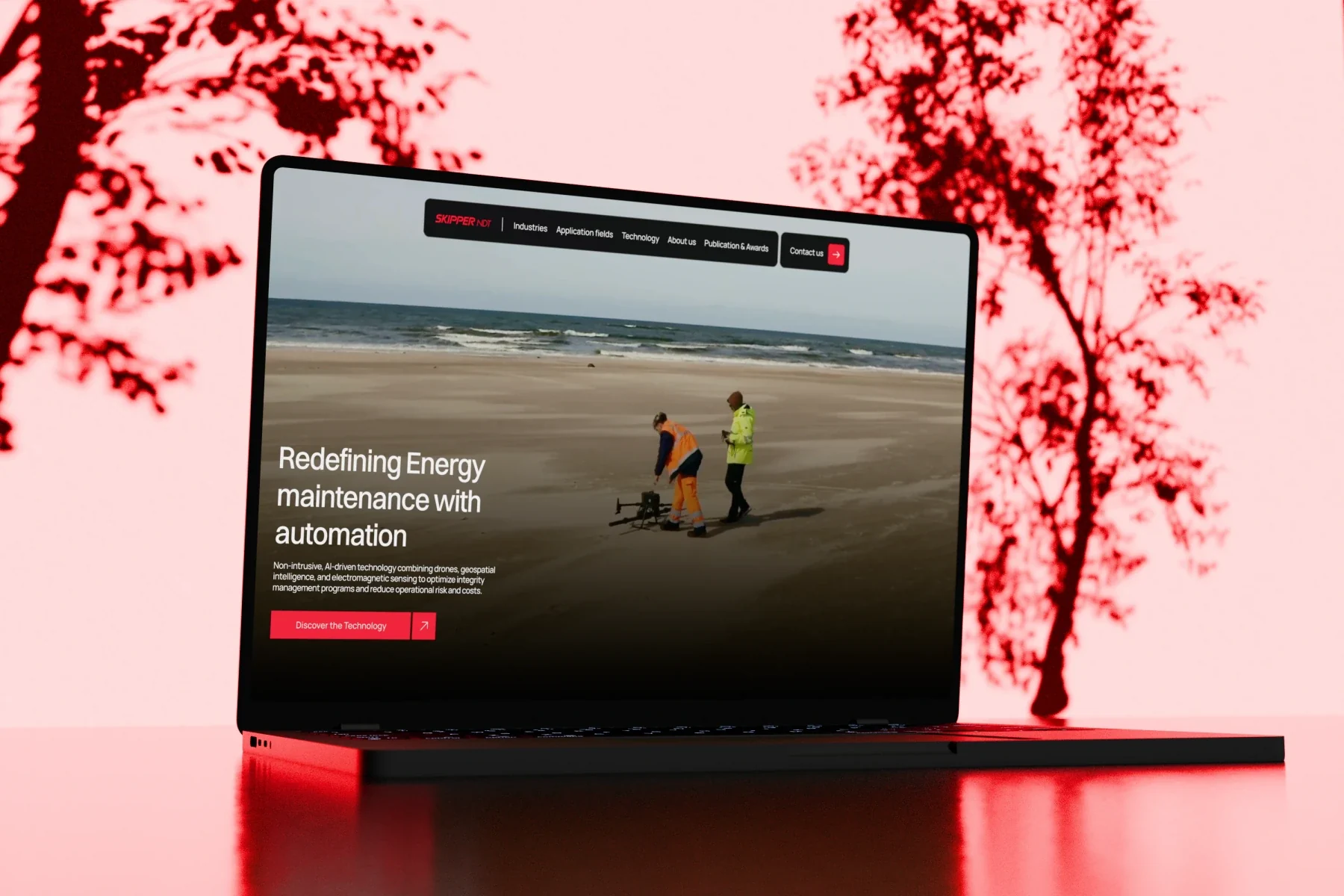 Showcase website
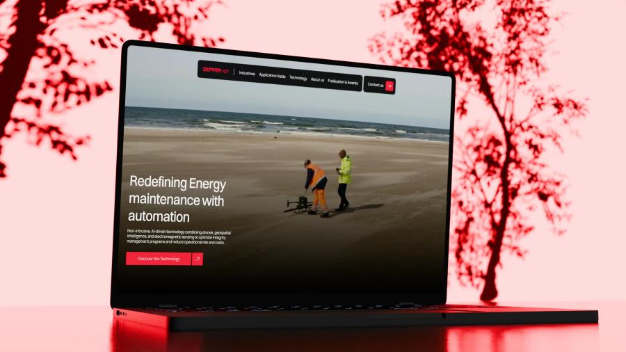
Skipper NDT: automating energy infrastructure maintenance
 Showcase website
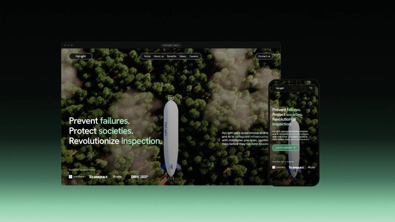
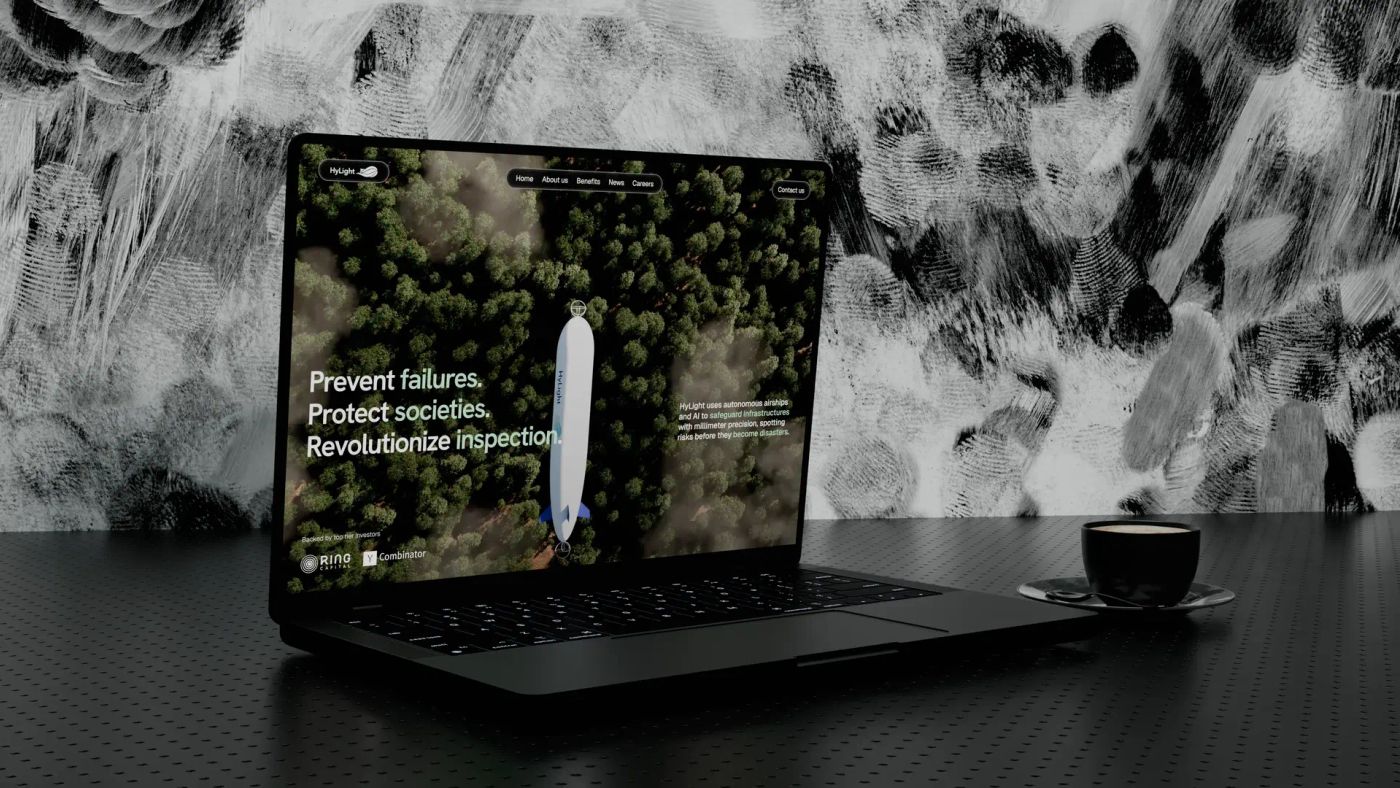
Hylight: an aerial inspection technology driven by design.
Can you design the site if our own developers build it?
Yes. We hand over live pages that look and behave like the finished site, the documented design system and every asset, and we can review the build against the design before launch.
Do you work in Figma?
We design in Framer and review designs as live pages that look and behave like the finished site, not as static frames. If your team already works in Figma, we start from your files.
Do you write the copy?
Yes. We interview the founders and the people who sell, then write the copy of every page with you. You review it section by section in the Junca client portal before anything is designed around it.
How do you design for several audiences?
We map who reads the site, what each audience needs to believe and where they arrive. The homepage carries one promise, and each audience gets a path to its own proof: technical pages for engineers, use cases for buyers, the company and the round for investors.
How long do website UX and design take?
Count 4 to 6 weeks for a focused site designed and built, and 8 to 12 weeks with branding, 3D or custom code. Design alone takes less; the plan is fixed with the quote.
What about accessibility?
Contrast, type sizes, focus states and touch targets are part of the design system, not a check at the end. Our own site scored 100 for accessibility in Lighthouse at launch.
How much does web design and UX cost?
It depends on the number of pages and audiences, the copy to write and whether we also build the site. You get a detailed quote after a free first call.
How to explain complex technology on a website (without dumbing it down)
4 min read
Jargon repels even when you define it, and visitors read 25% of your words. The layered-narrative method we use to make deeptech legible, from Hylight to Kestrix.
UX and conversion rate: 7 design mistakes that drive your visitors away
5 min read
The most common UX mistakes we see on tech company websites, and how to fix them to stop losing conversions.

The investor-ready website: what VCs actually look at before a Series A
5 min read
Your deck gets two minutes of attention. Your website gets the rest of the diligence. What VCs actually check on a startup website before a Series A, backed by Harvard and DocSend research.
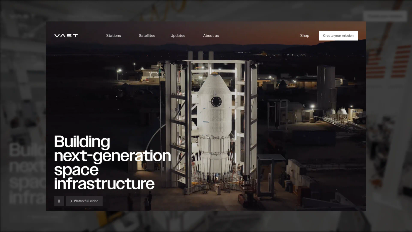
The 12 best deeptech websites in 2026, and why they work
9 min read
Twelve deeptech sites that won Awwwards Site of the Day, from Vast to Breakthrough Energy, and the four design moves that put them there.
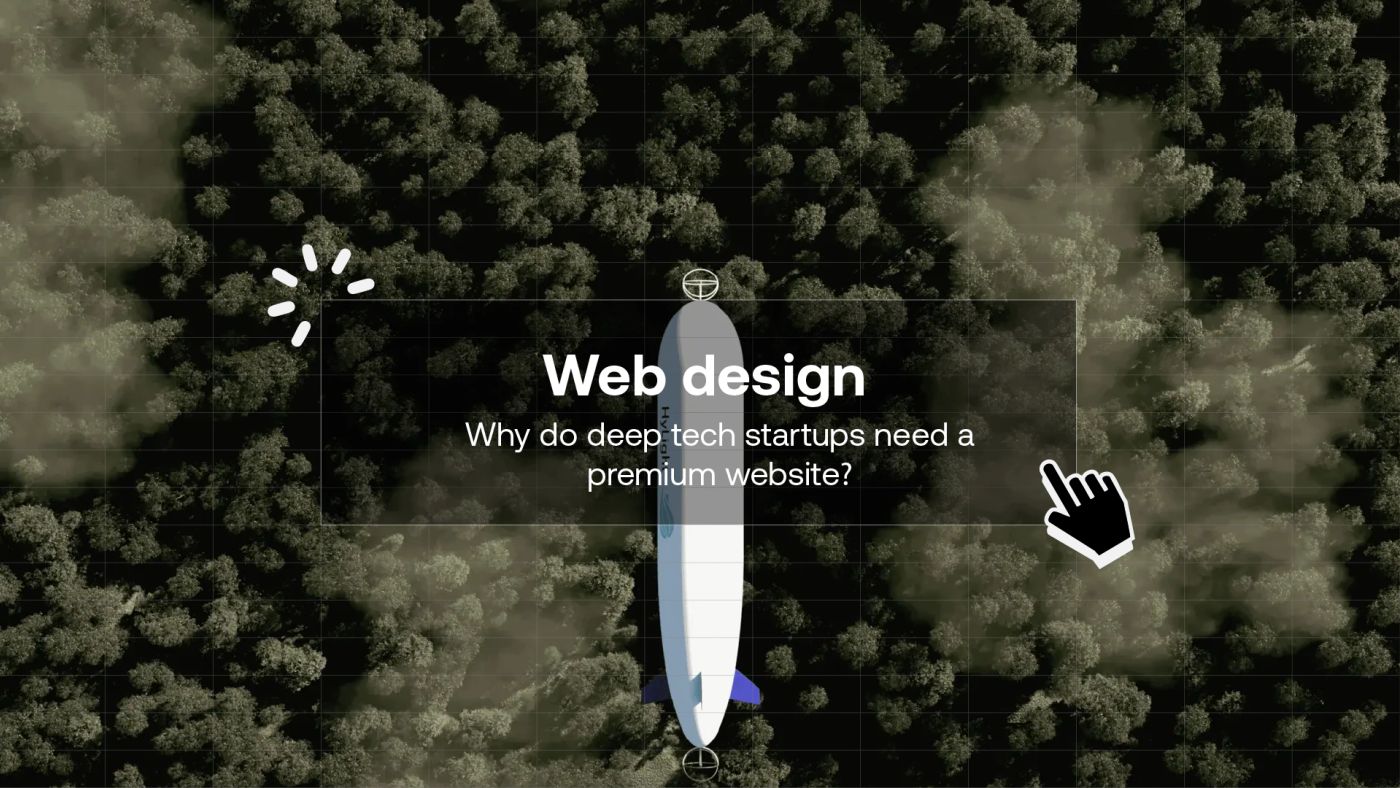
Why deeptech startups need a premium website
5 min read
A generic website is no longer enough for a deeptech startup. Investor credibility, talent acquisition, market positioning: why web design is an underestimated strategic lever.
Other services